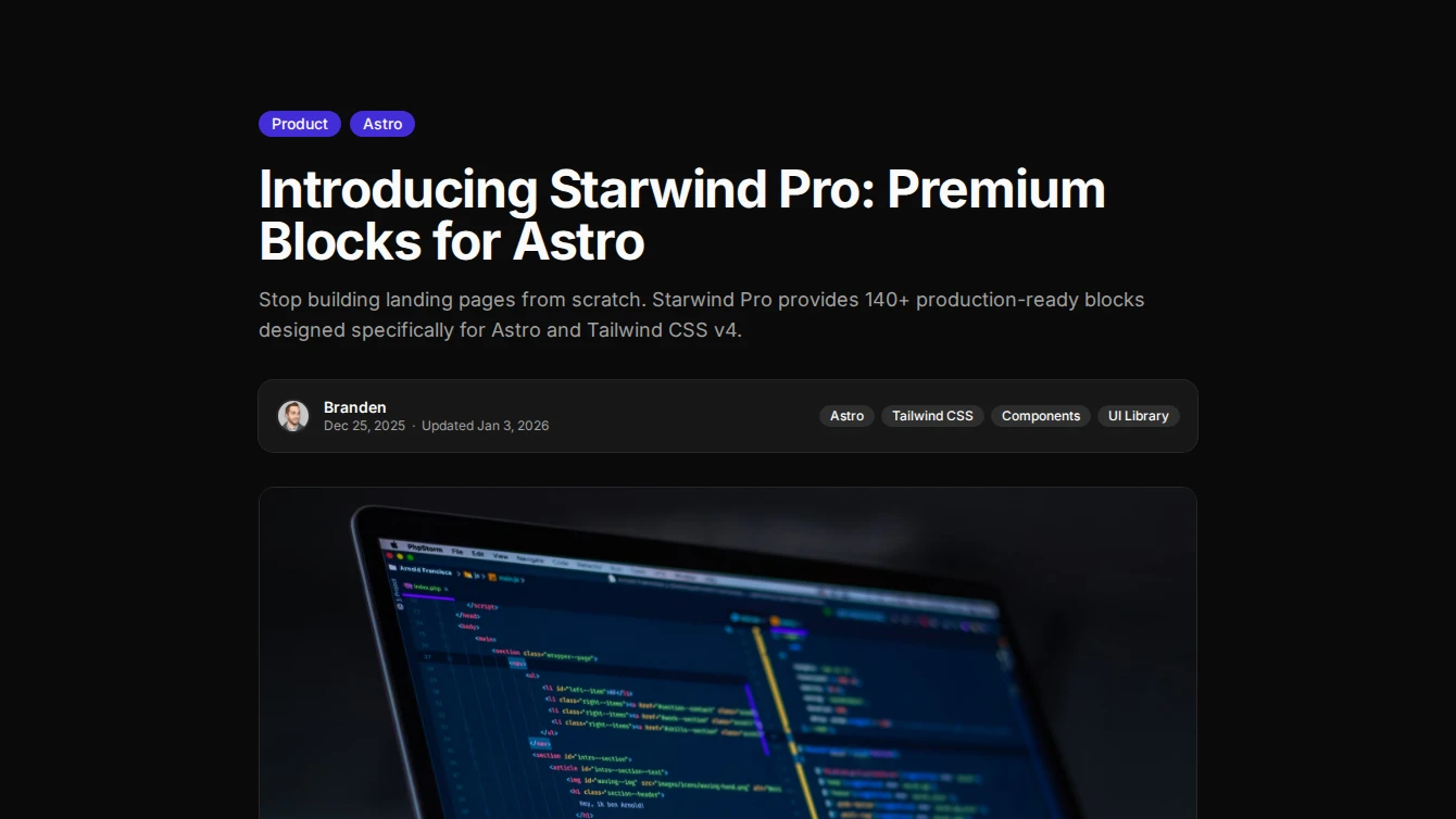
New Blocks Added: January 2026 - February 2026
31 new blocks added to Starwind Pro from 2026-01-24 to 2026-02-25. Includes blog-post, effect, feature, legal-page, navigation, pricing, service-page, services, specialized-components components.


Branden
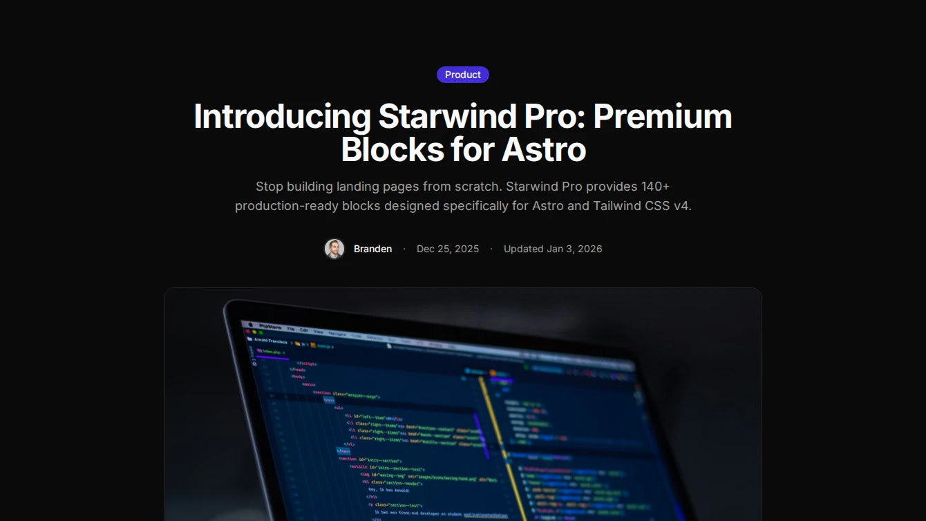
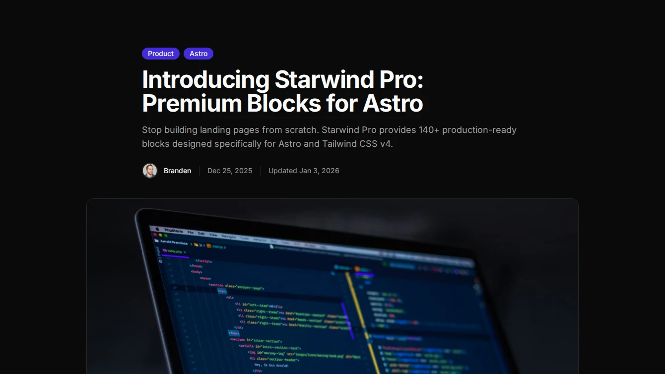
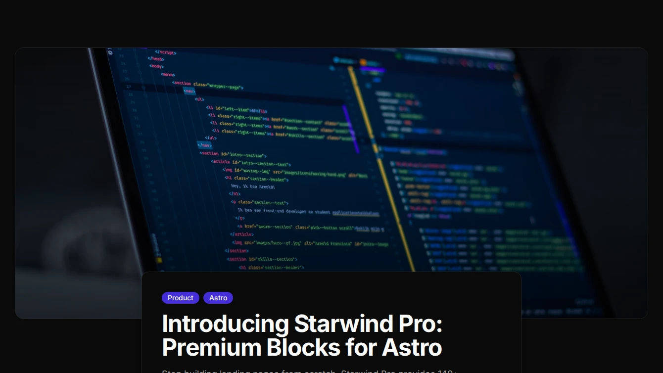
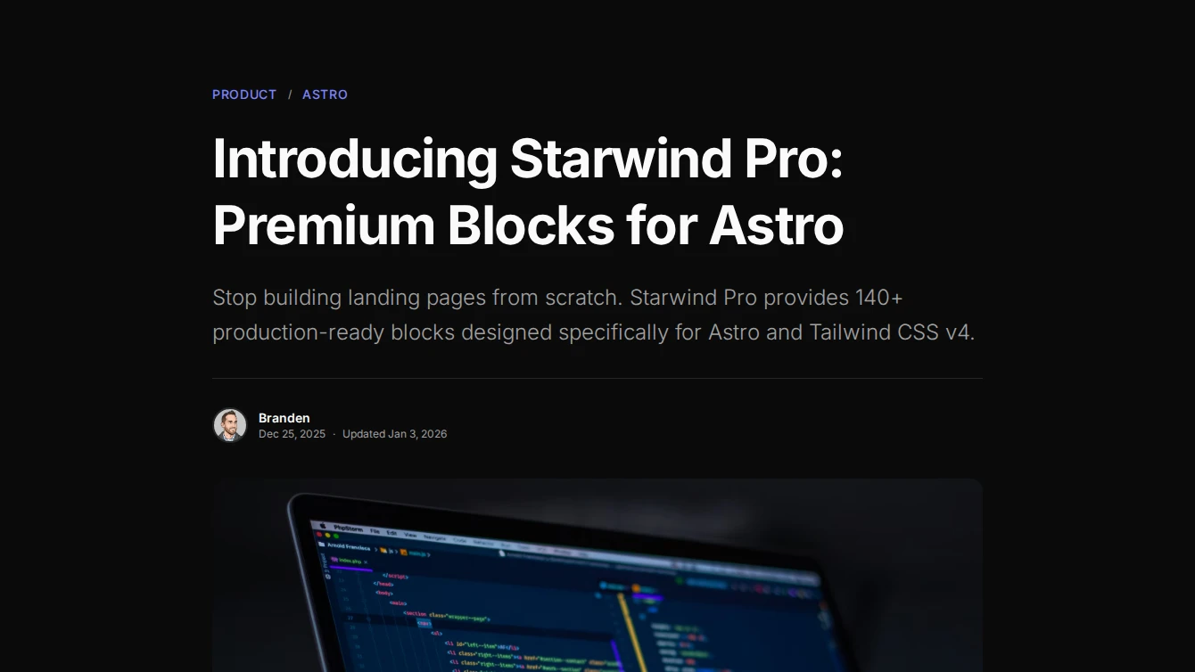
We’ve added 31 new blocks to Starwind Pro! Here’s what’s new:
Summary
- Blog-post: 6 blocks
- Effect: 1 block
- Feature: 3 blocks
- Legal-page: 6 blocks
- Navigation: 2 blocks
- Pricing: 2 blocks
- Service-page: 6 blocks
- Services: 2 blocks
- Specialized-components: 3 blocks
Blog-post
6 new blog-post blocks.

- Blog Post 1 - Centered: A clean centered blog post layout with hero image, single category badge, author avatar, and prose content slot.
- Blog Post 2 - With Table of Contents: A blog post layout with content on the left and a sticky table of contents sidebar on the right.
- Blog Post 3 - Full-Width Hero: A blog post layout with a full-width hero image and overlapping content card below for a modern, immersive reading experience.
- Blog Post 4 - Sidebar Author: A blog post layout with a sticky author and metadata sidebar on the left and main content on the right.
- Blog Post 5 - Magazine Editorial: An editorial-style blog post with large hero, decorative dropcap, pull quotes, and refined typographic hierarchy for a magazine-like reading experience.
- Blog Post 6 - Reading Progress: A card-wrapped blog post layout with a fixed reading progress bar, floating category breadcrumbs, and polished metadata display.
Effect
1 new effect block.
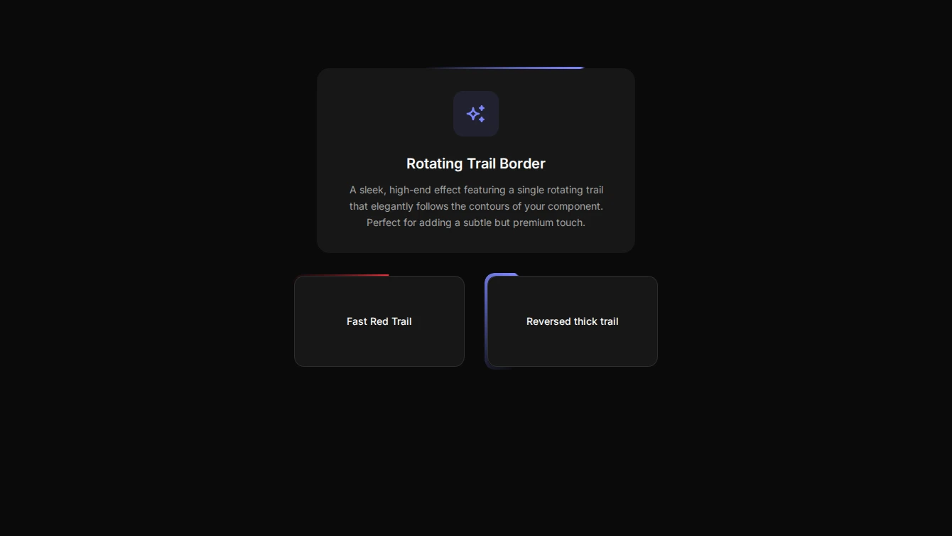
- Effect 13 - Rotating Trail Border: A premium animated border effect that looks like a single trail of the primary accent color rotating continuously around the element.
Feature
3 new feature blocks.
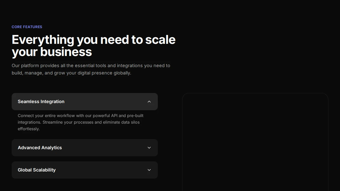
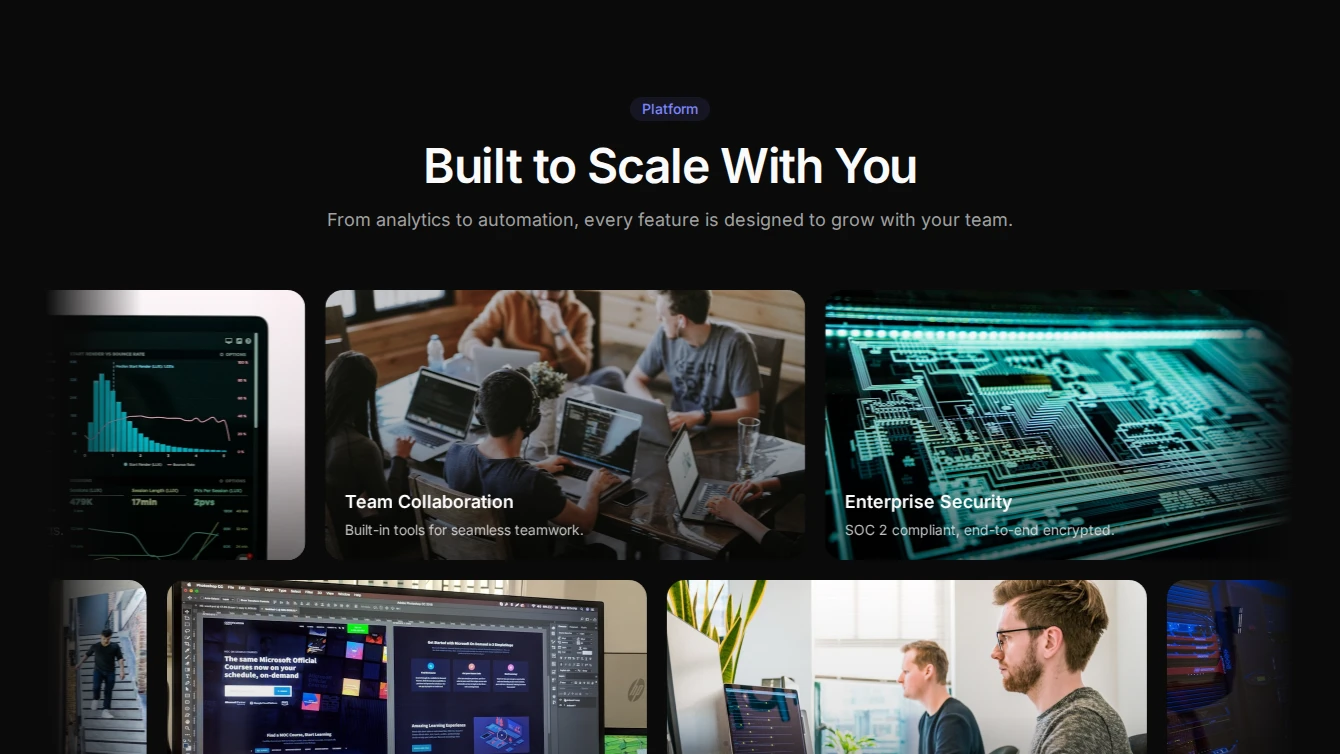
- Feature 23 - Accordion Image Swap: A dynamic feature section with an accordion that swaps corresponding images on the right with smooth CSS transitions.
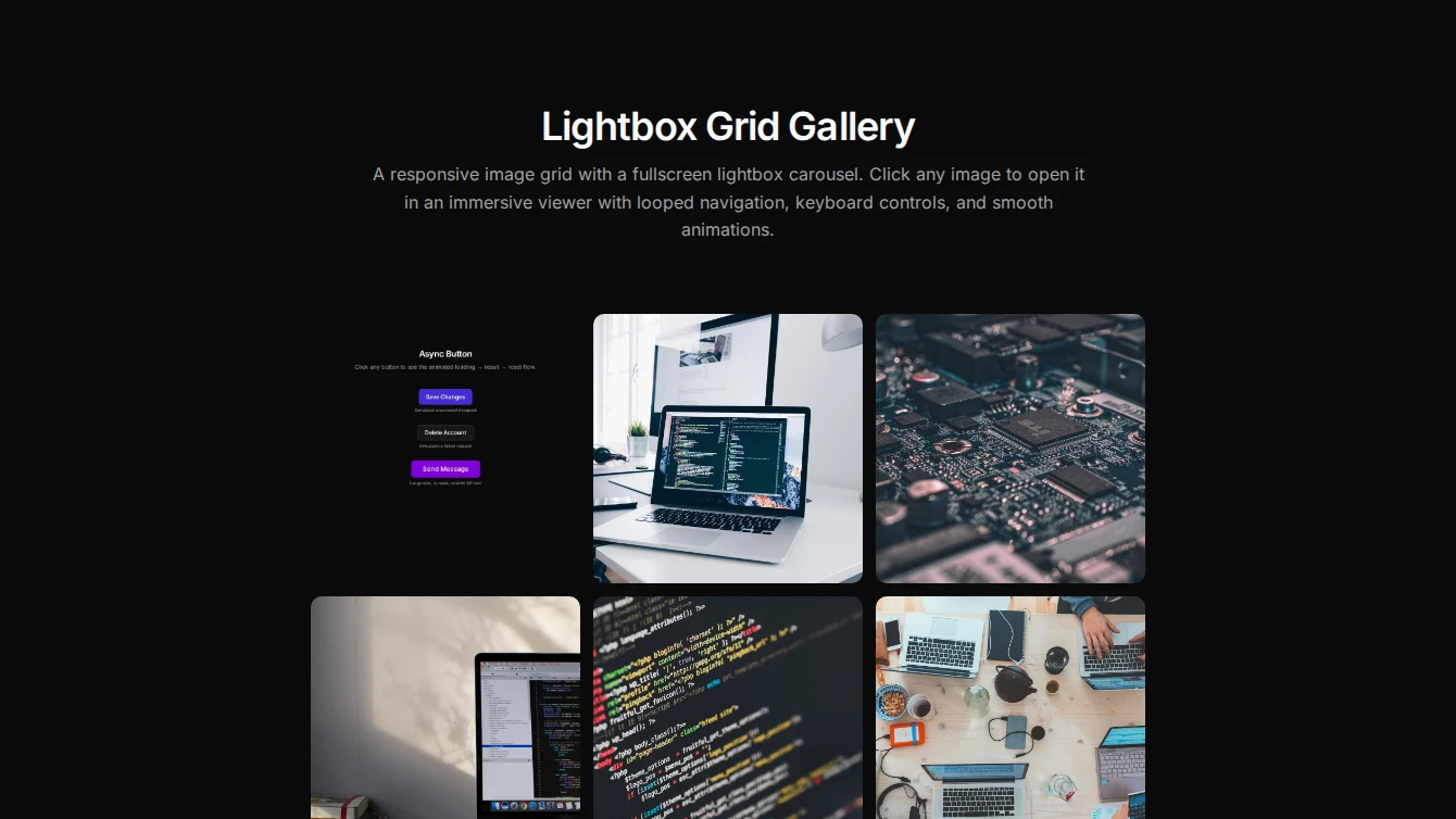
- Feature 24 - Lightbox Gallery: An editorial feature section with a staggered image grid that opens a fullscreen lightbox carousel. Perfect for showcasing product features and screenshots.
- Feature 25 - Marquee Gallery: A cinematic two-row marquee of feature images with title overlays, alternating scroll directions, and pause-on-hover. Great for visual feature showcases.
Legal-page
6 new legal-page blocks.
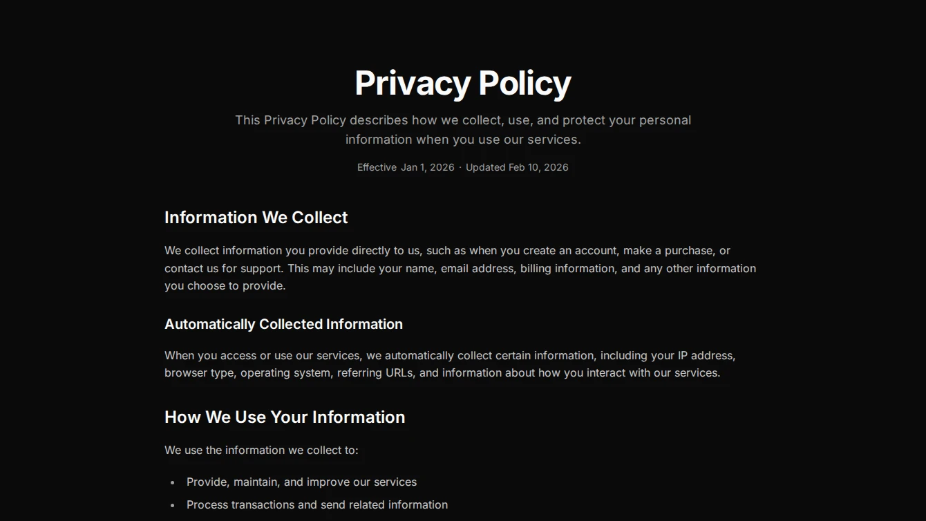
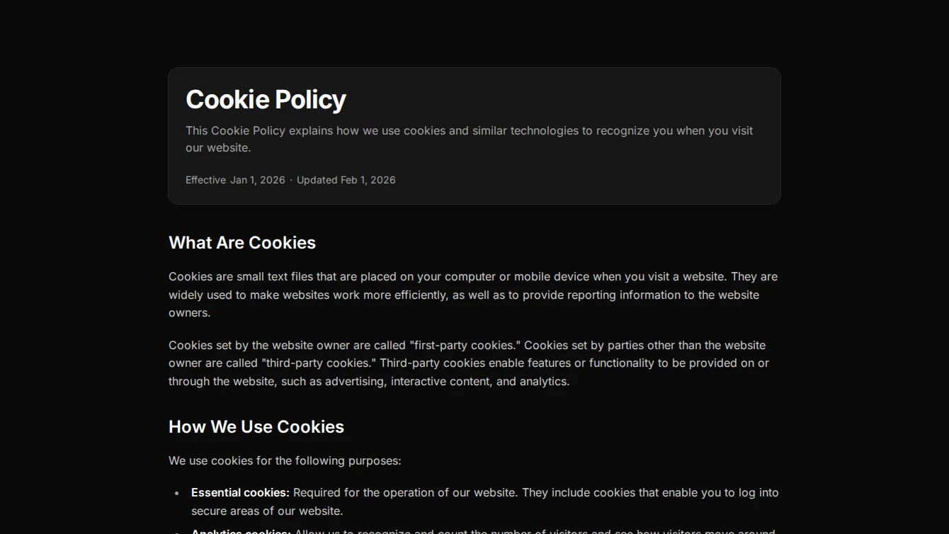
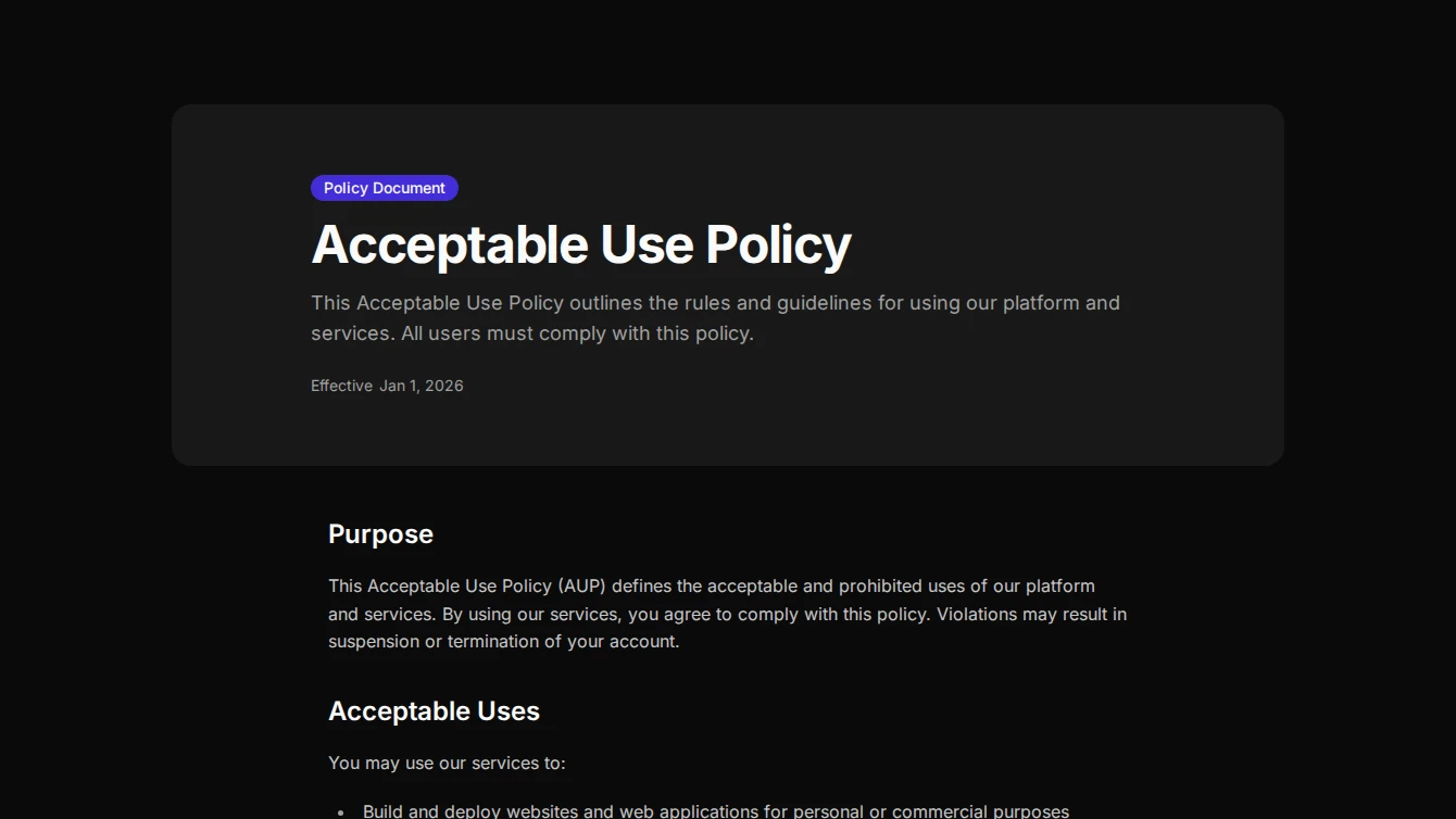
- Legal Page 1 - Clean Centered: A classic centered legal page layout with a clean header, date metadata, and prose content slot.
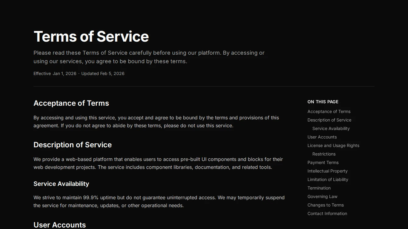
- Legal Page 2 - Sidebar TOC: A legal page layout with a sticky table of contents sidebar that auto-generates from page headings, ideal for long legal documents.
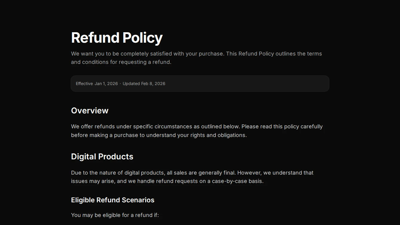
- Legal Page 3 - Card Header: A legal page layout with title and metadata presented in a card component, providing a formal separation between the header and prose content.
- Legal Page 4 - Full-Width Banner: A legal page layout with a muted full-width banner header and a document type badge, transitioning to clean prose content below.
- Legal Page 5 - Reading Progress: A legal page layout with a fixed reading progress bar and card-wrapped metadata, ideal for tracking position in long legal documents.
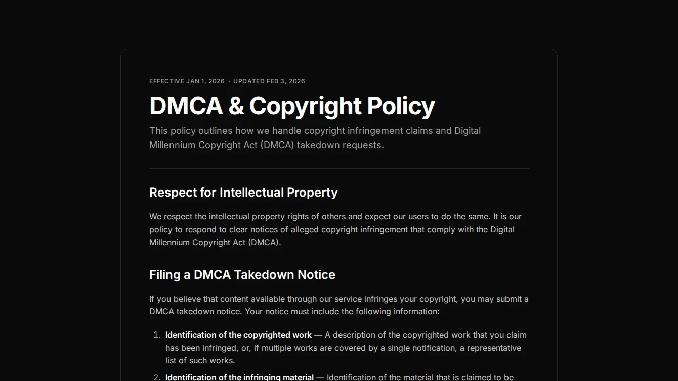
- Legal Page 6 - Bordered Document: A formal legal page layout with a bordered document container and structured header with separator, evoking a printed document feel.
Navigation
2 new navigation blocks.
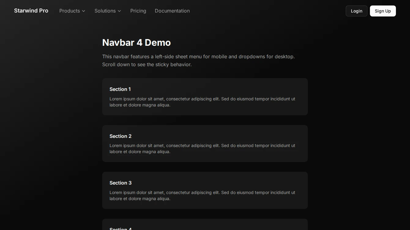
- Navbar 4 - Left Sheet Mobile: Professional navigation bar with a left-side sheet menu for mobile devices and clean desktop layout.
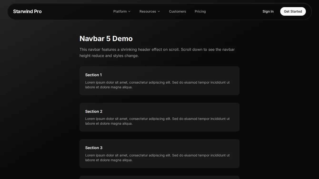
- Navbar 5 - Shrinking Header: Premium navigation bar featuring a dynamic height shrinking effect on scroll and custom dropdown menus.
Pricing
2 new pricing blocks.
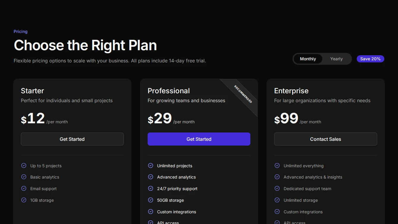
- Pricing 13 - Three Card With Toggle: Premium pricing section with left-aligned header on desktop, custom segmented billing toggle, and sleek ‘Recommended’ banners on featured cards. Reordered card layout with circle-check icons.
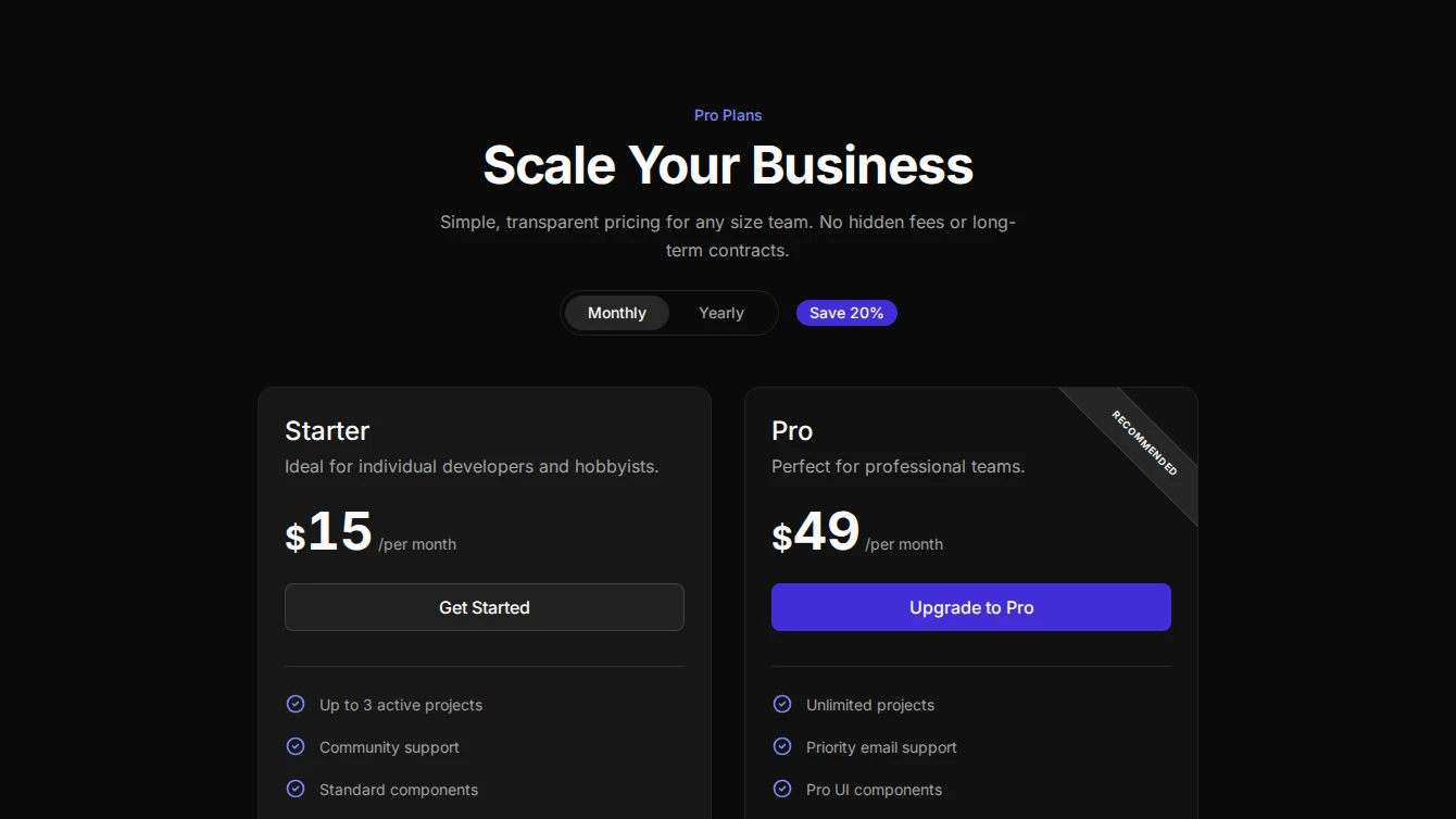
- Pricing 14 - Two Card With Toggle: Grid-background pricing section with left-aligned header on desktop, custom segmented billing toggle, and sleek ‘Recommended’ banners on featured cards. Reordered card layout with circle-check icons.
Service-page
6 new service-page blocks.
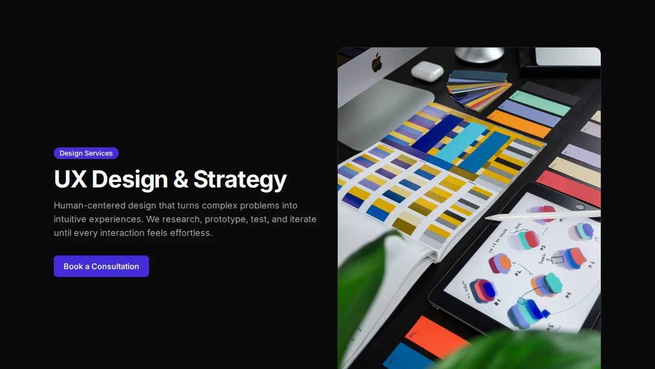


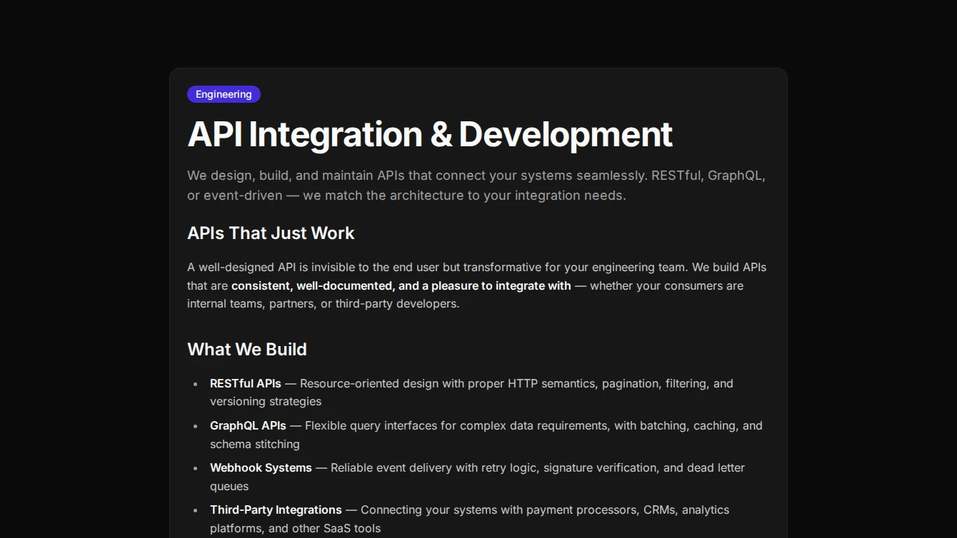
- Service Page 1 - Centered: A clean centered service page layout with optional badge, hero image, and prose content slot for rich service descriptions.
- Service Page 2 - Split Hero: A two-column service page layout with title and CTA on the left, constrained image on the right, and full-width prose content below.
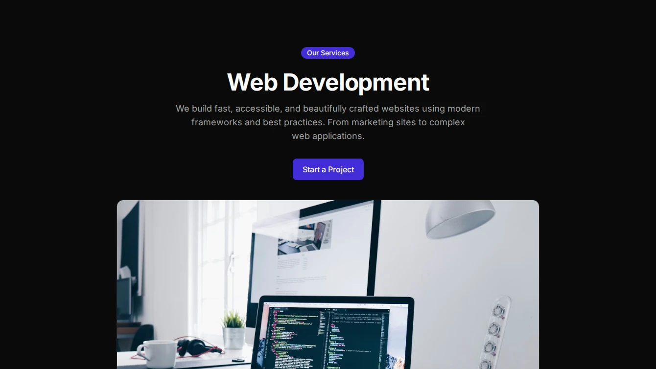
- Service Page 3 - Full-Width Hero: A bold service page layout with a full-bleed hero image, gradient overlay for title and description, and contained prose content below.
- Service Page 4 - Minimal Typographic: A typography-driven service page layout with oversized title, lead description, separator, and optional small figure image for a minimal aesthetic.
- Service Page 5 - Card Wrapped: A contained service page layout with all content wrapped in a card component, optional inset image, and CTA footer for a clean boxed aesthetic.
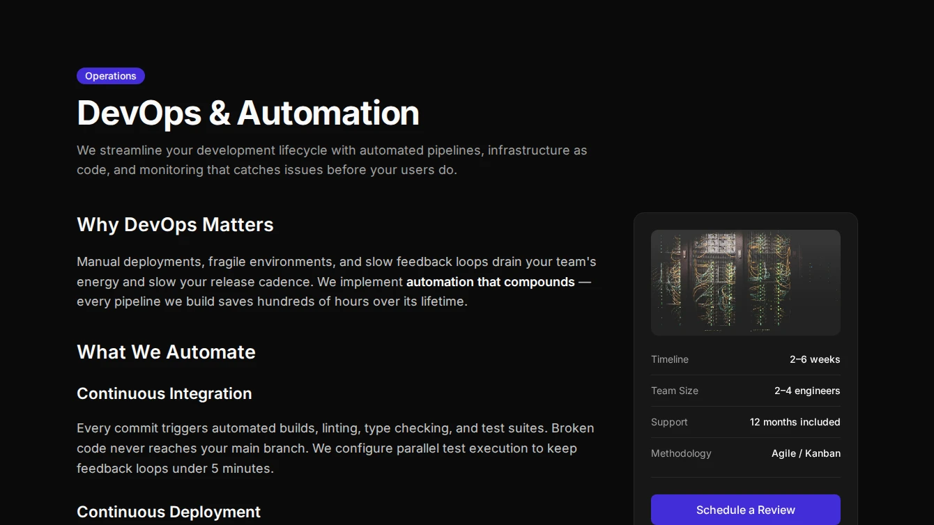
- Service Page 6 - Sidebar Info: A two-column service page layout with main prose content on the left and a sticky sidebar with image, CTA, and key highlights on the right.
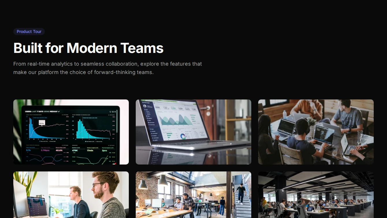
Services
2 new services blocks.
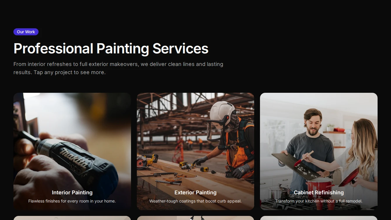
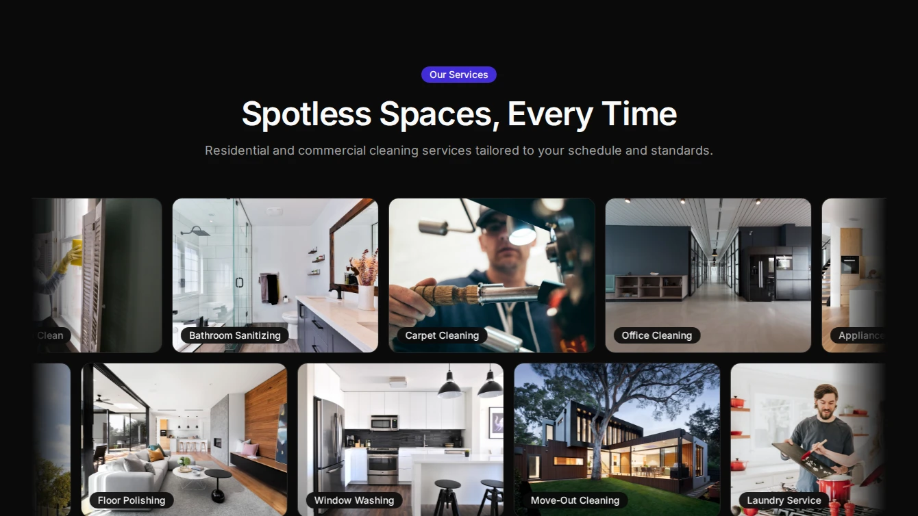
- Services 9 - Lightbox Portfolio: A bold services section with a captioned image grid that opens a fullscreen lightbox carousel. Ideal for showcasing service portfolios and project galleries.
- Services 10 - Marquee Showcase: A three-row scrolling marquee of service images with badge labels, alternating directions, and varying speeds. Pauses on hover for an engaging browsing experience.
Specialized-components
3 new specialized-components blocks.
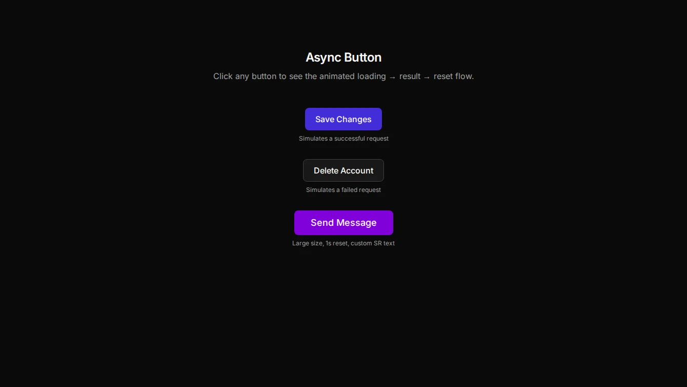
- Async Button 1 - Animated State Button: An interactive button that animates through loading, success, and error states. Ideal for form submissions, login flows, and any async operations that need visual feedback.
- Lightbox 1 - Grid Gallery: A responsive image grid that opens a fullscreen lightbox carousel with looped navigation, backdrop click close, Escape close, and body scroll lock.
- Progress 1 - Reading Progress Bar: A sticky reading progress indicator that tracks scroll position within a target element, perfect for blog posts and long-form content.
Browse all blocks at /components or install with the Starwind CLI.