New Blocks Added: February 2026 - June 2026
34 new blocks added to Starwind Pro from 2026-02-26 to 2026-06-08. Includes code-block, effect, feature, hero, integration, profile, services, testimonial components.


Branden
We’ve added 34 new blocks to Starwind Pro! Here’s what’s new:
Summary
- Code-block: 6 blocks
- Effect: 3 blocks
- Feature: 3 blocks
- Hero: 8 blocks
- Integration: 6 blocks
- Profile: 6 blocks
- Services: 1 block
- Testimonial: 1 block
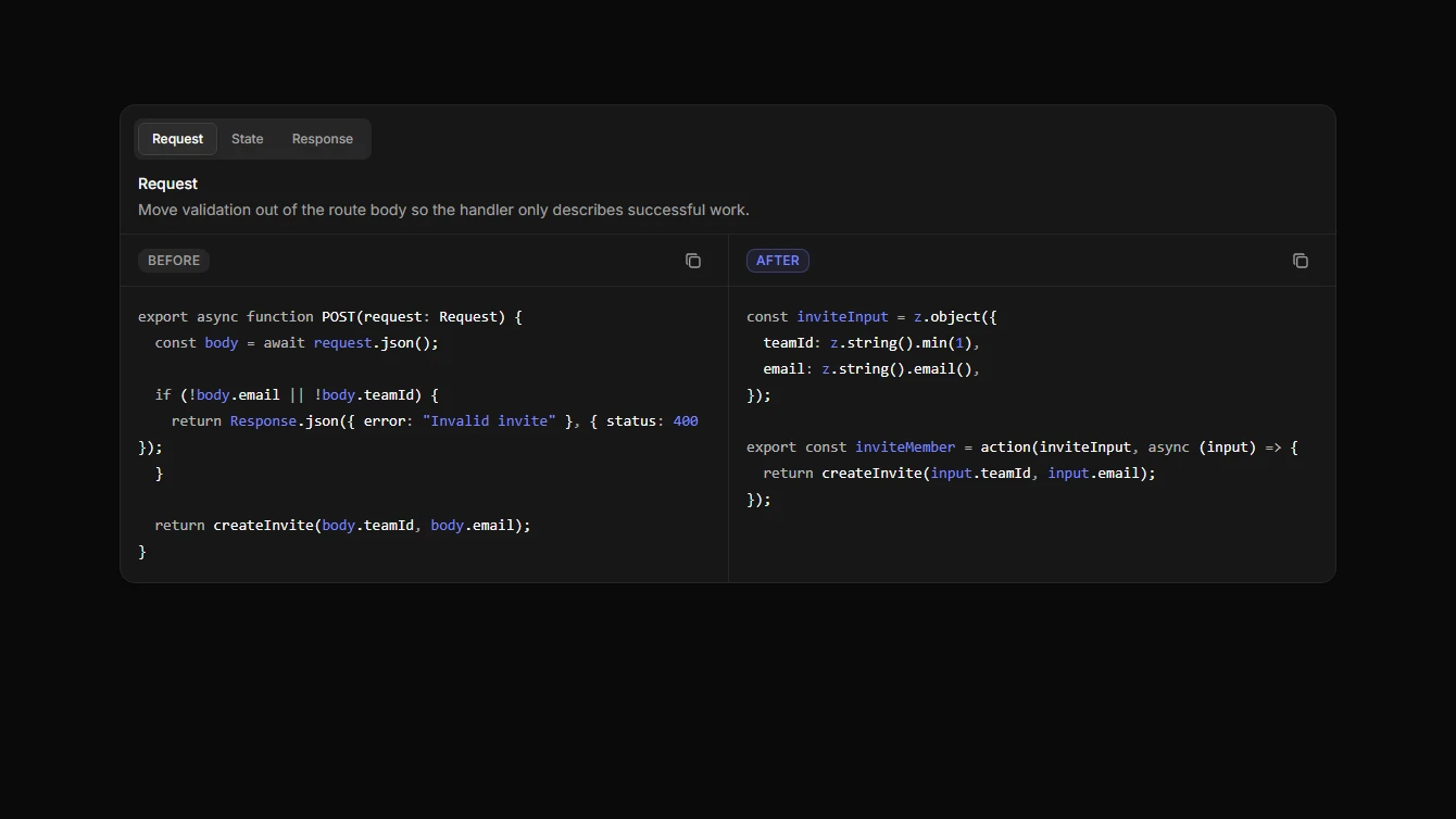
Code-block
6 new code-block blocks.
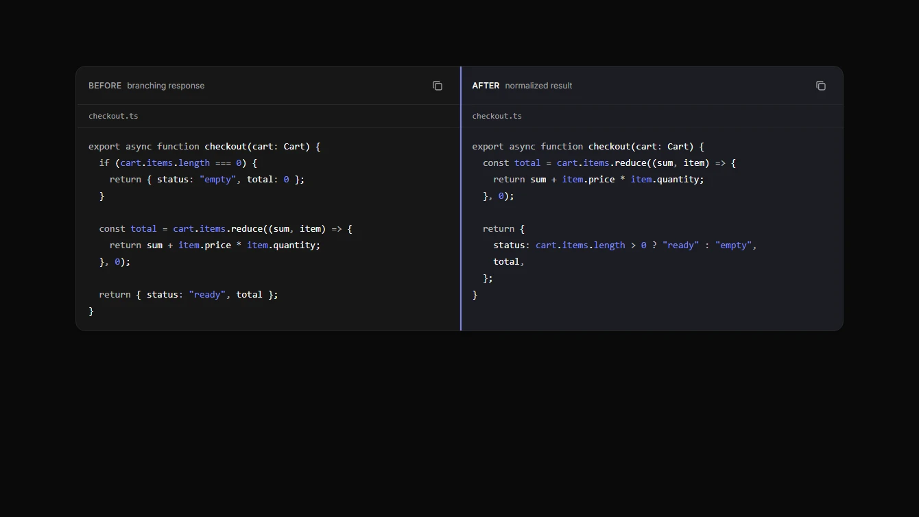
- Code Block 1 - Static Wrapper: A lightweight syntax highlighted code block wrapper powered by Astro’s built-in Code component.
- Code Block 2 - Language Tabs: A dark tabbed code showcase for comparing the same example across multiple programming languages.
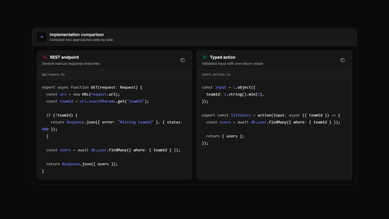
- Code Block 3 - Split Comparison: A split-pane code comparison component for showing before and after snippets, API migrations, or competing implementations.
- Code Block 4 - Sliding Language Tabs: A tabbed code comparison component with a sliding active indicator for switching between programming languages.
- Code Block 5 - Minimal Comparison: A clean two-pane code comparison component with a minimal divider, filenames, syntax highlighting, and per-pane copy controls.
- Code Block 6 - Tabbed Review Matrix: A tabbed code comparison component using Starwind Tabs to review multiple before-and-after implementation concerns in one compact surface.
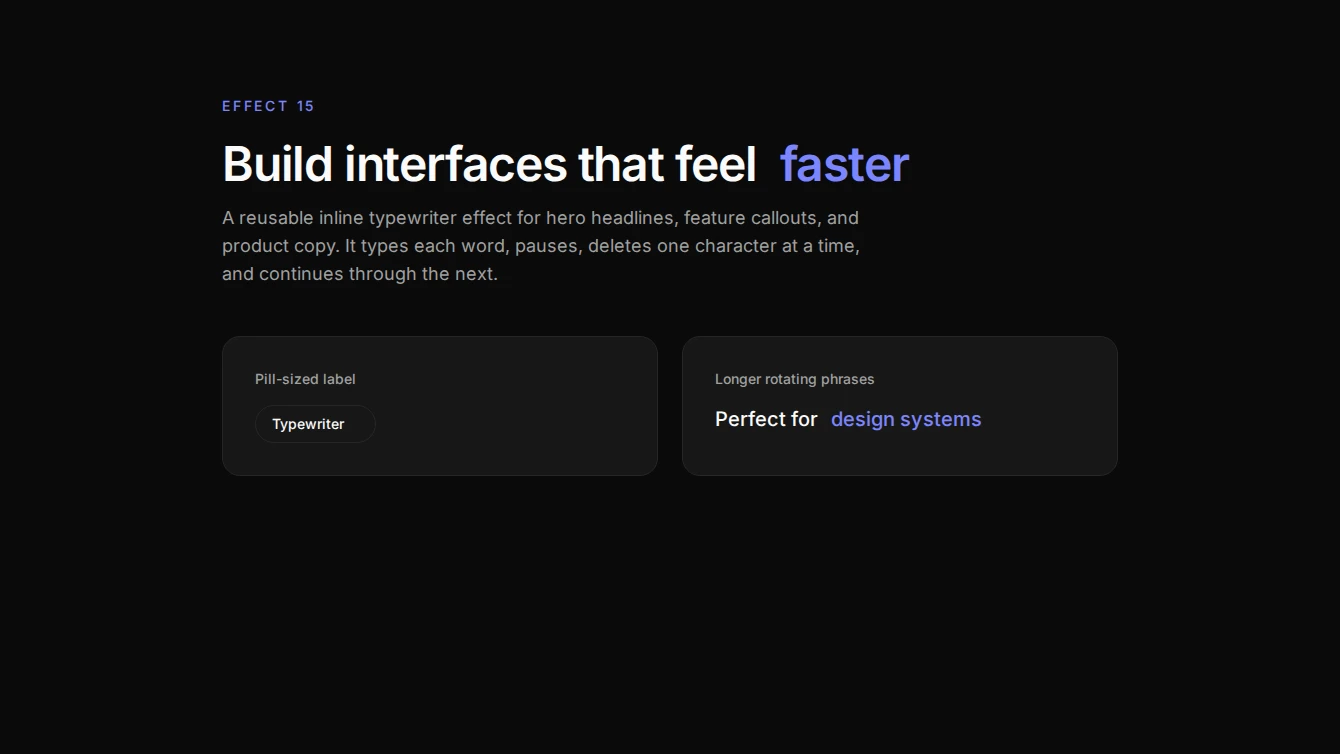
Effect
3 new effect blocks.
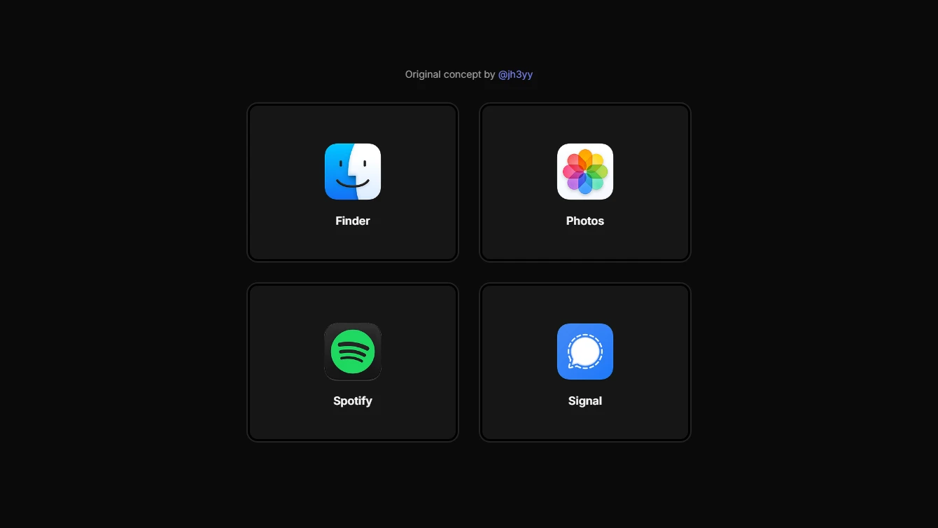
- Effect 14 - Context-Aware Hover Cards Blur: A context-aware hover card grid with centered logos and a cursor-reactive blur spotlight layer for a sleek premium feel.
- Effect 15 - Typewriter Text: A reusable inline typewriter text effect that cycles through an array of words by typing, pausing, deleting, and repeating.
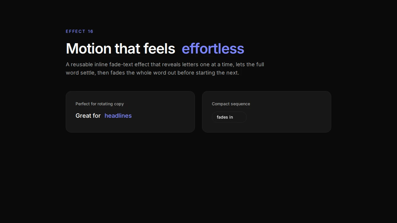
- Effect 16 - Sequential Fade Text: A reusable inline text effect that reveals each word one letter at a time with fade-in, then fades the full word out before moving to the next.
Feature
3 new feature blocks.
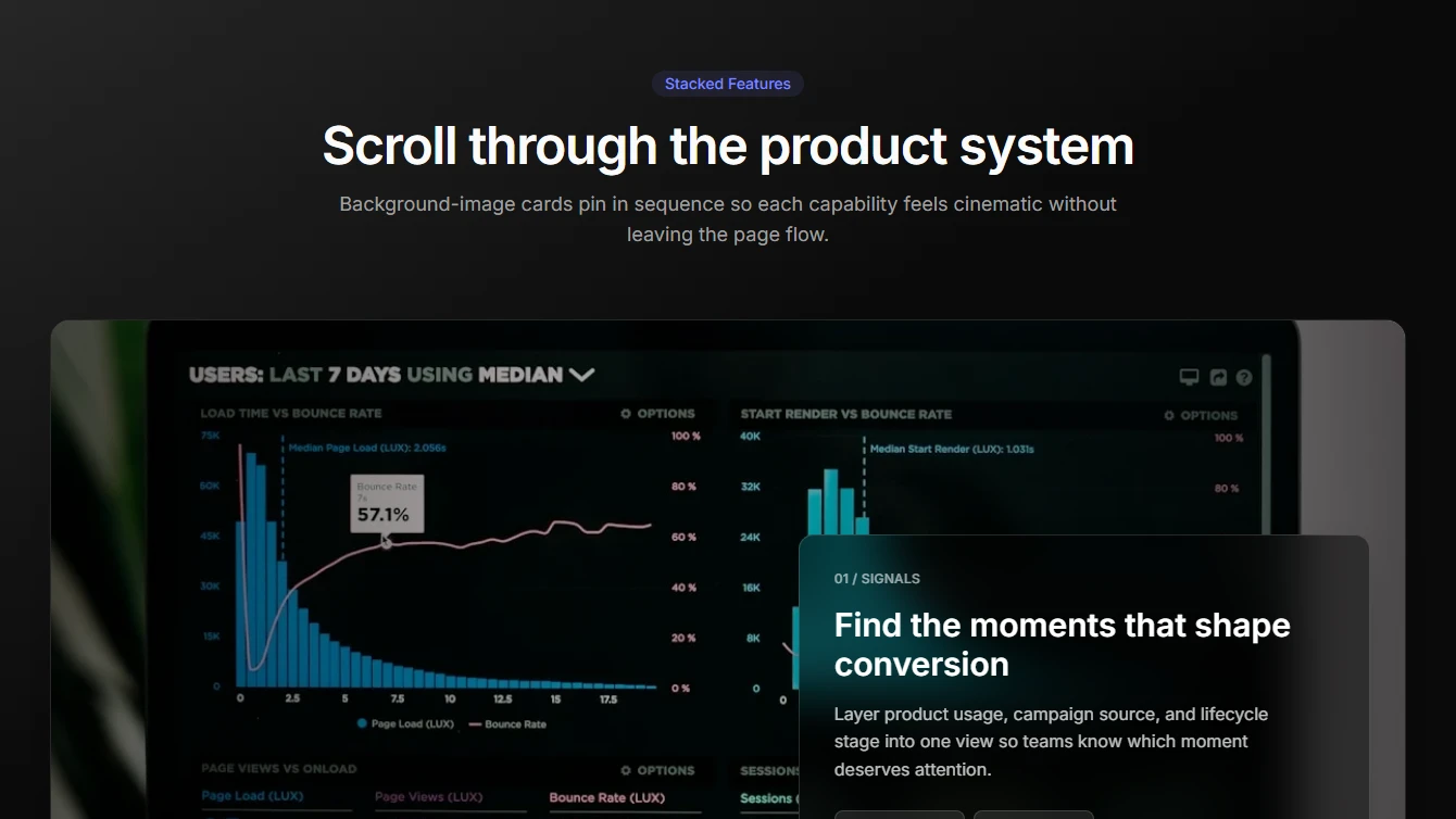
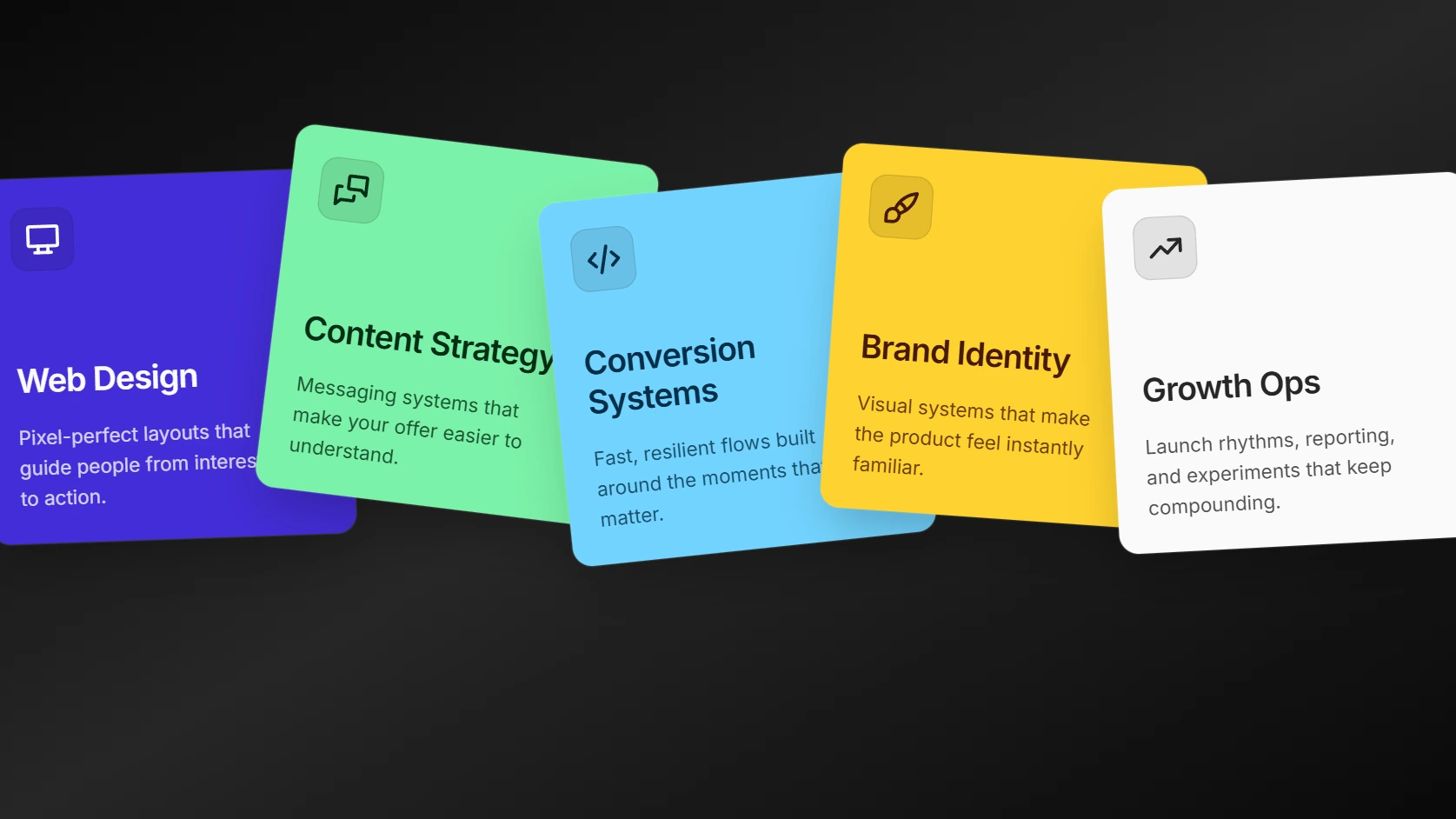
- Feature 26 - Stacked Background Cards: A cinematic stacked feature section with background-image cards, glass content panels, and Motion-powered scroll reveals.
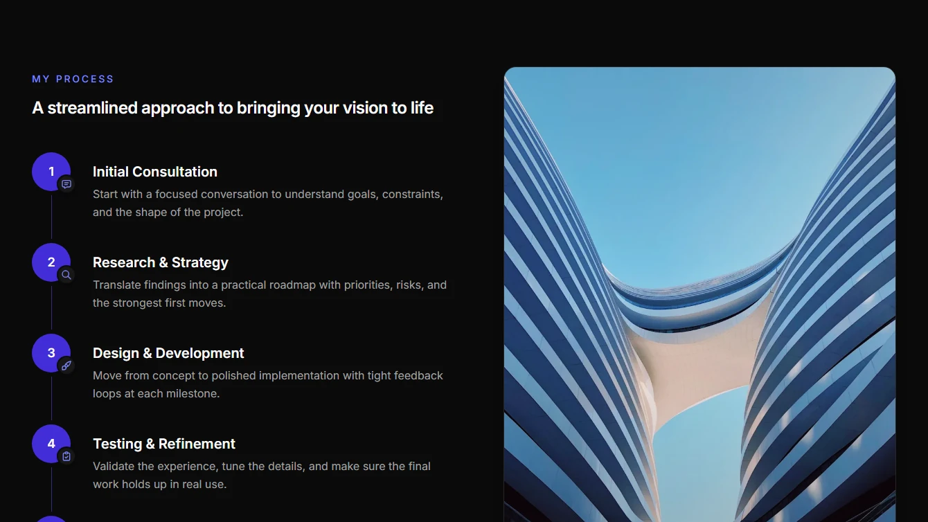
- Feature 27 - Vertical Process: A vertical process section with numbered steps on the left and a tall editorial image on the right.
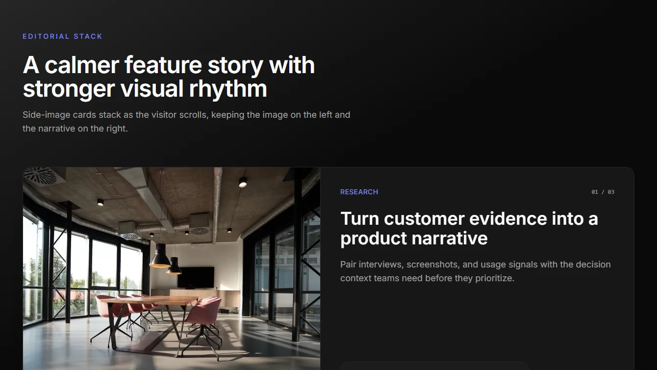
- Feature 28 - Editorial Stack: A clean editorial stacked feature section with left-side imagery, right-side copy, stats, and Motion-powered scroll reveals.
Hero
8 new hero blocks.


- Hero 15 - Cinematic Split: A cinematic split hero with a full-bleed background image, top-positioned social proof, left-aligned content, and a highlighted right-side image panel.
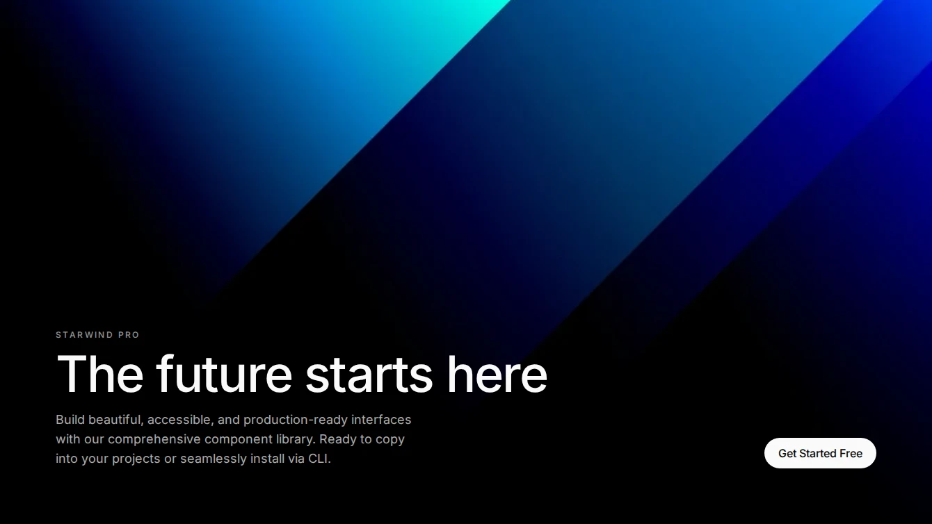
- Hero 16 - Prism Left Visual: A differentiated split hero with layered background gradients, a prominent left-side showcase image, top social proof, and conversion-focused content on the right.
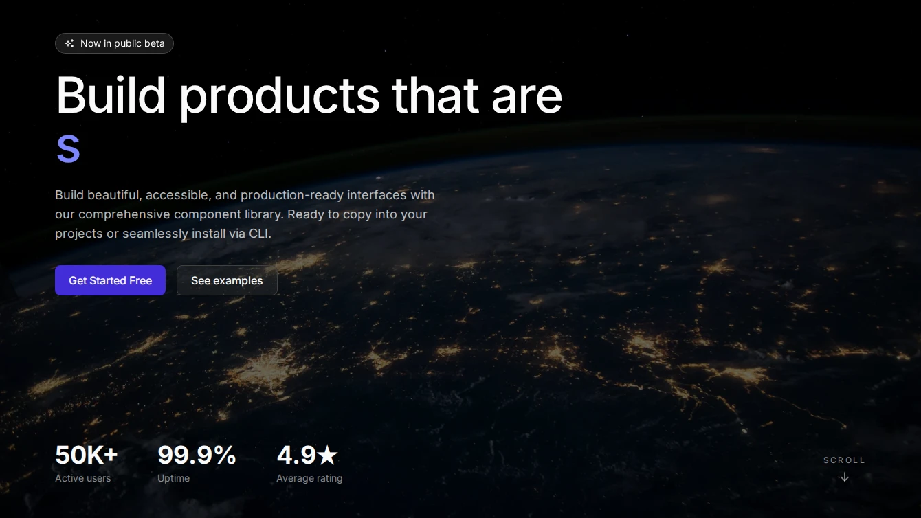
- Hero 17 - Fullscreen Typewriter: Full-viewport background image hero with an inline typewriter effect, top-left content, bottom-left stats, and a bottom-right scroll indicator.
- Hero 18 - Bottom Split: Full-viewport background image hero with a gradient overlay. Hero text anchors to the bottom-left and CTA buttons sit at the bottom-right.
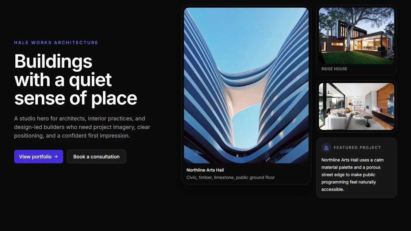
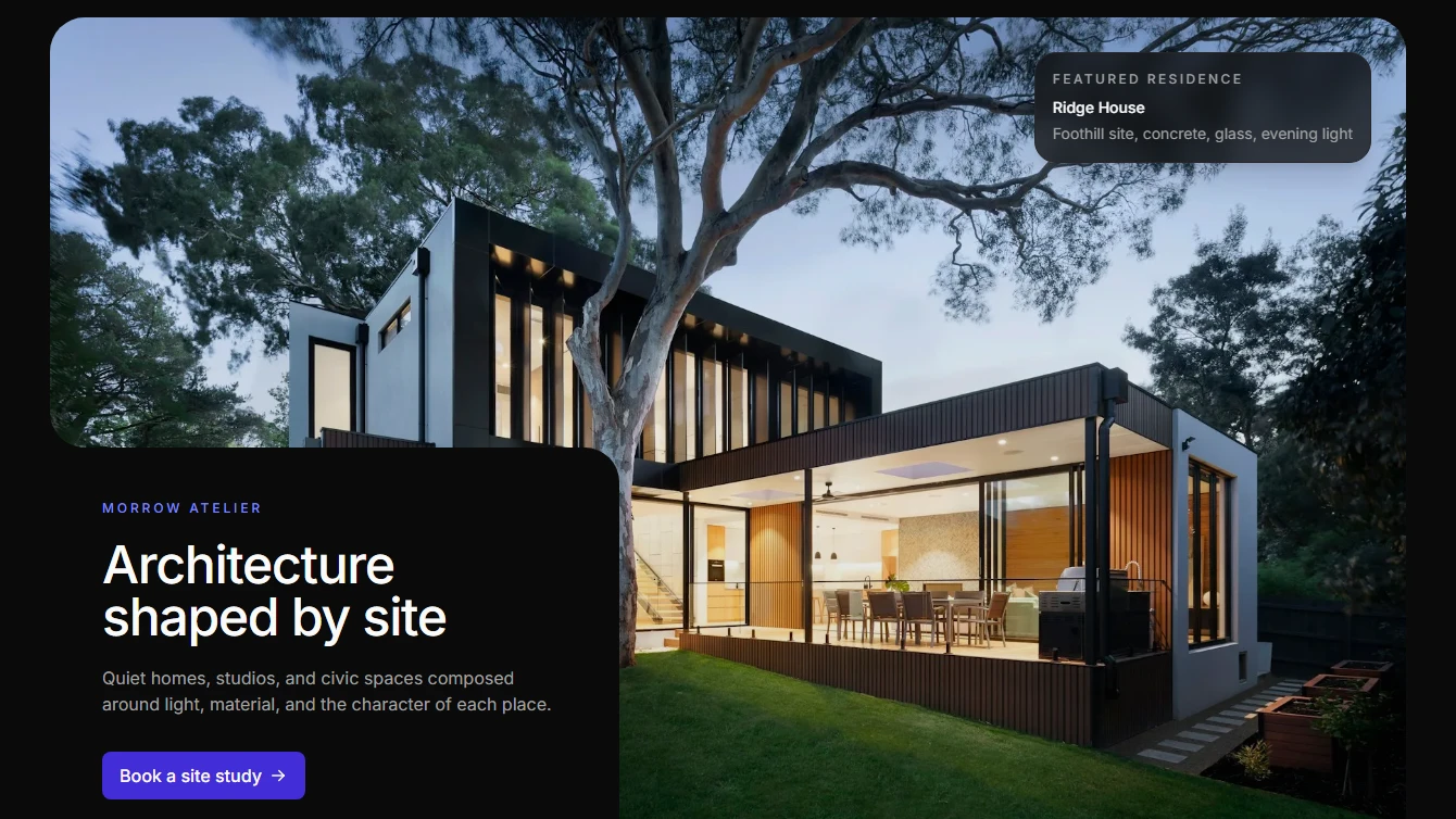
- Hero 19 - Architecture Collage: Architecture studio hero with an asymmetric project-image collage, plan-grid backdrop, concise positioning, and two clear calls to action.
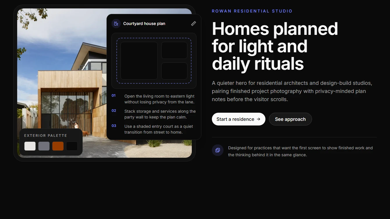
- Hero 20 - Blueprint Editorial: Editorial architecture hero combining finished project photography with a plan-sheet overlay, material palette, concise copy, and project-start CTAs.
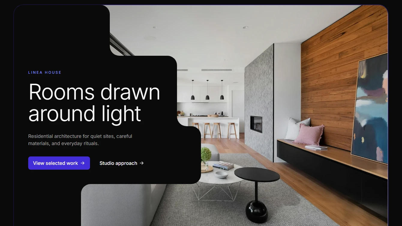
- Hero 21 - Clipped Image Card: Editorial architecture hero with a large bounded image, rounded lower-left page-background text cutout, restrained project caption, and concise project-start CTA.
- Hero 22 - Courtyard Cutout: Architecture hero with a large bounded image, stepped left-side page-background cutout for copy, and gallery-like spacing.
Integration
6 new integration blocks.
- Integration 1 - Cards with Blur Effect: Left-aligned heading and description with interactive blur effect cards. Responsive layout stacks on mobile.
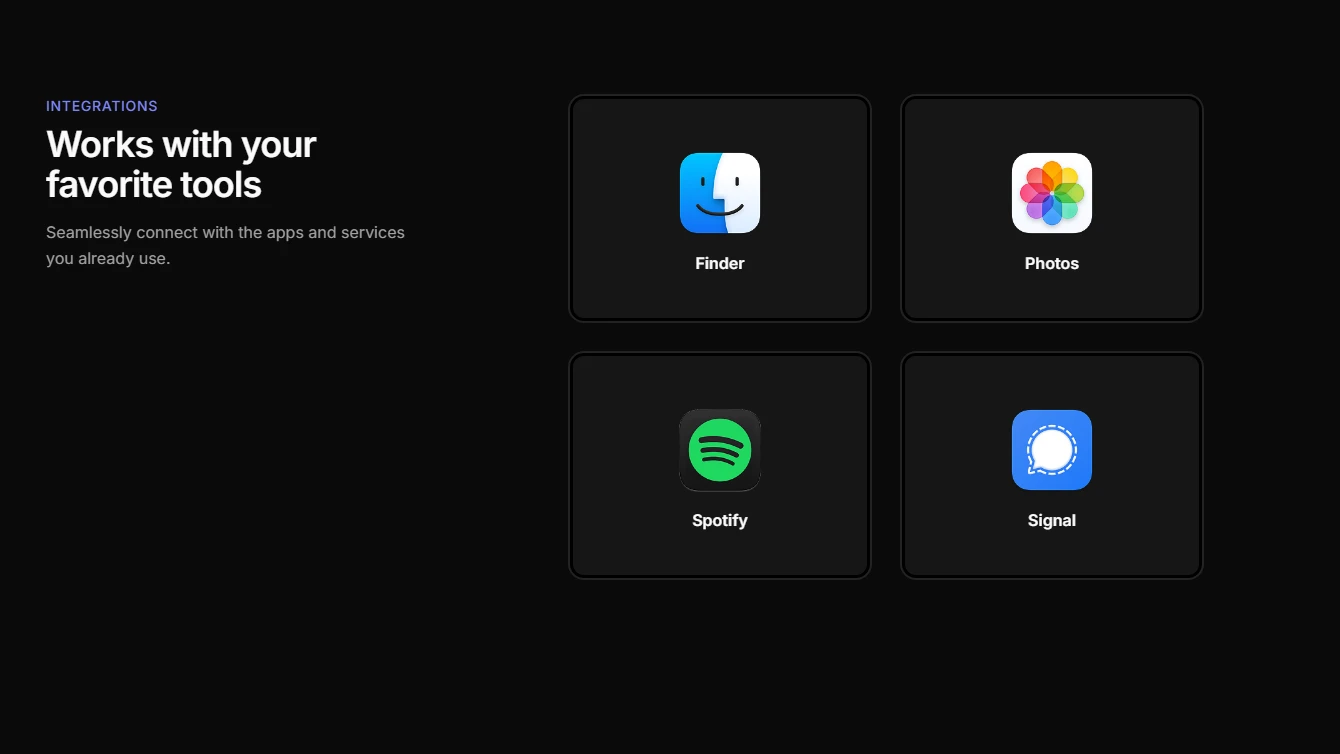
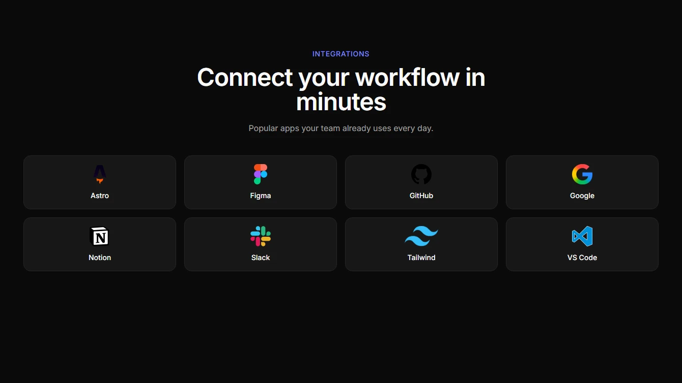
- Integration 2 - Simple Logo Grid: A lightweight integration logo grid with concise copy and clean responsive spacing.
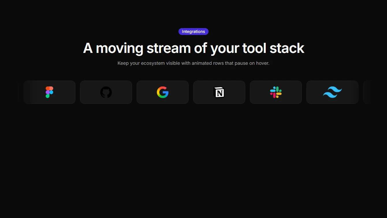
- Integration 3 - Single Row Marquee: A single-row marquee of integration logos with edge fades and pause-on-hover interaction.
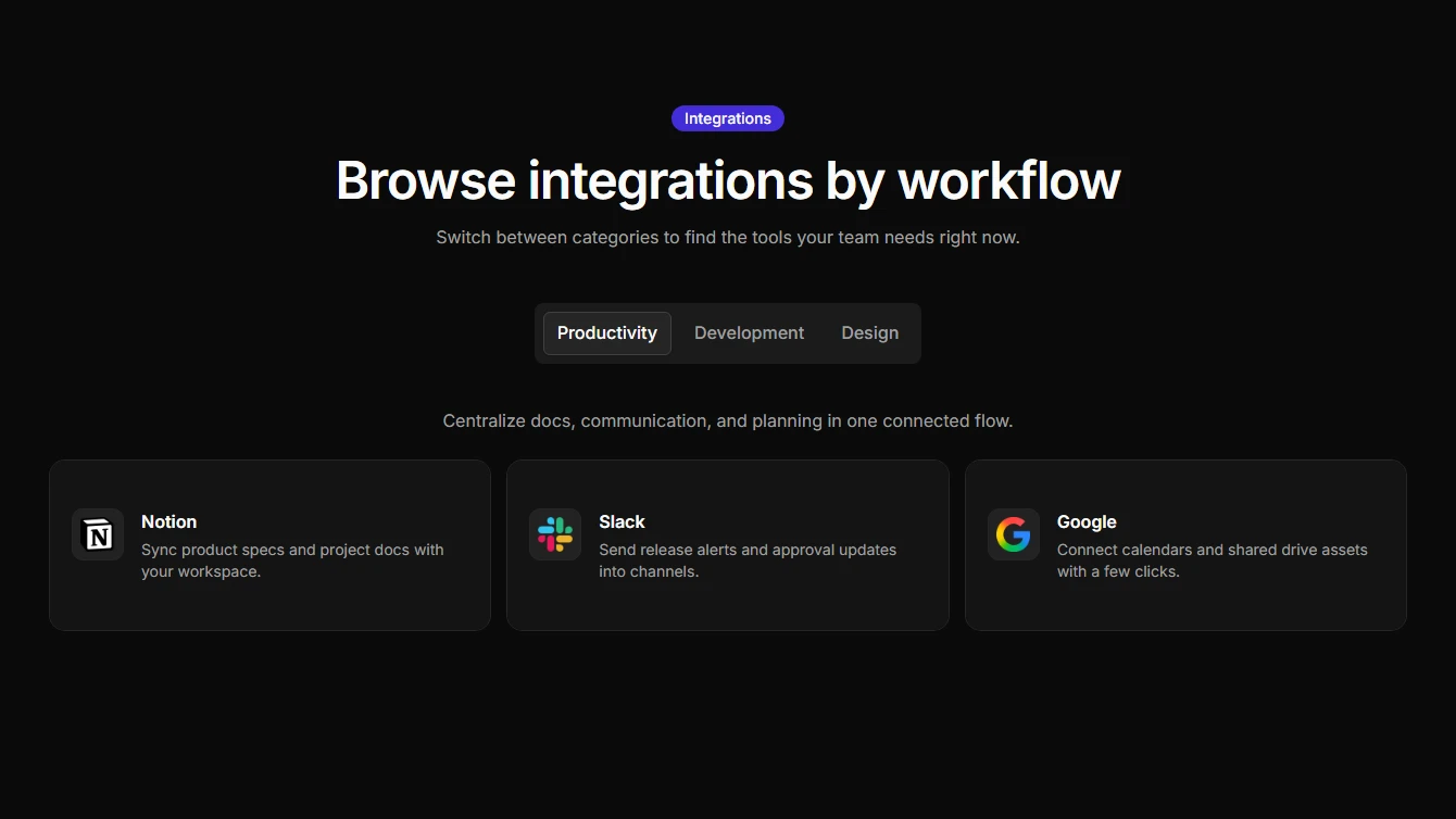
- Integration 4 - Categorized Integrations: Tab-based integration categories with descriptive cards for each tool.
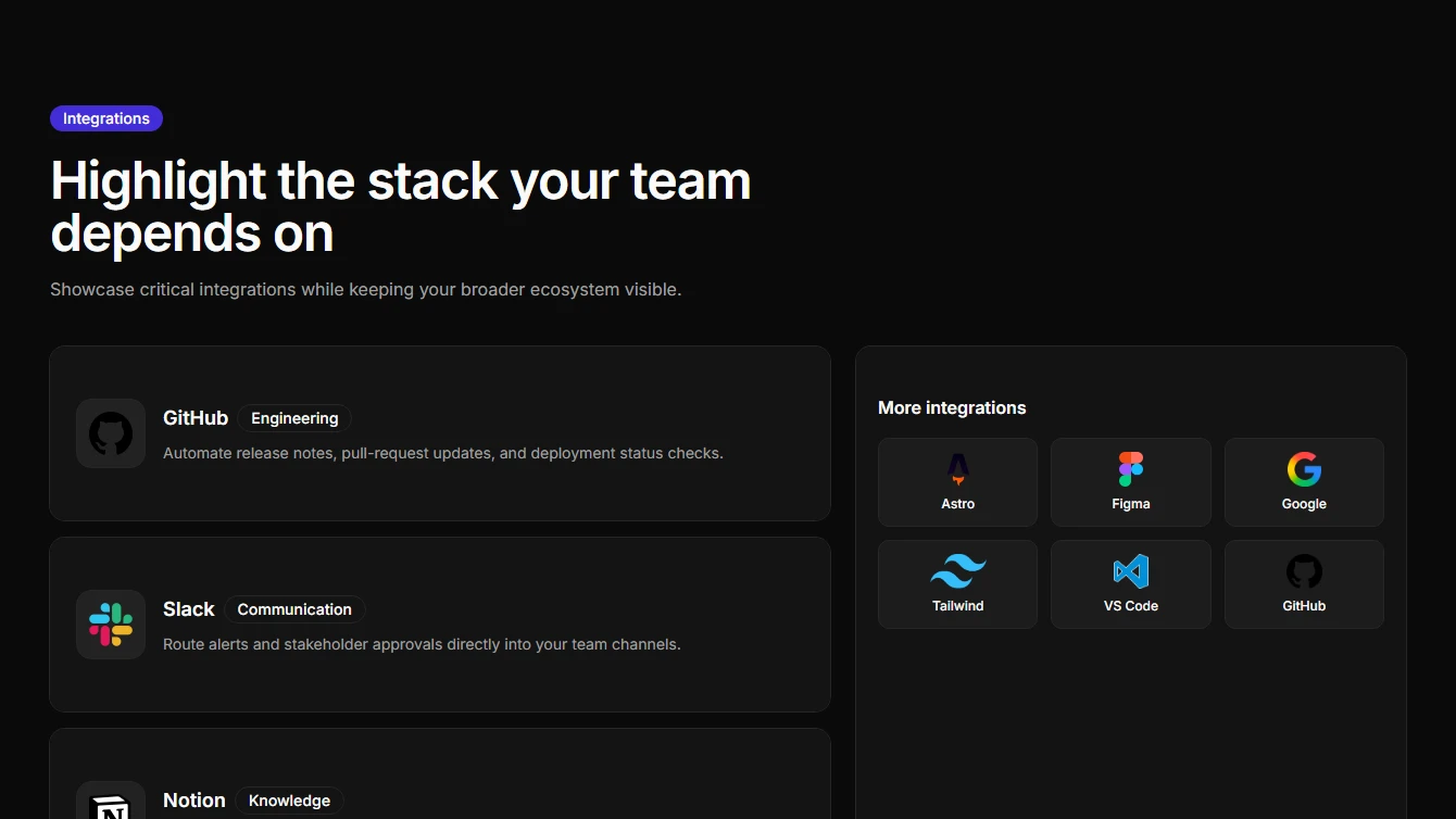
- Integration 5 - Featured Split Layout: A split layout that highlights featured integrations alongside a compact support grid.
- Integration 6 - Orbit Rings: A top-half concentric orbit layout that positions integration logos around a central hub.
Profile
6 new profile blocks.
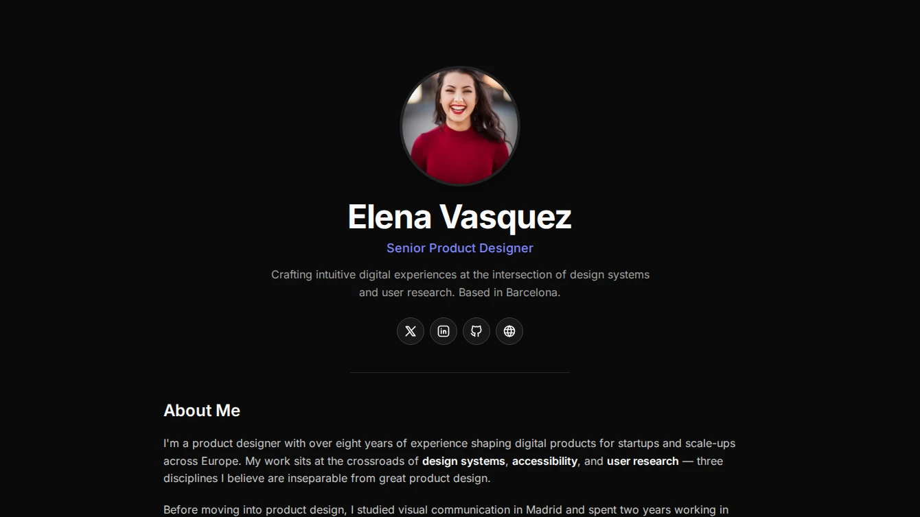


- Profile 1 - Centered Clean: A minimal centered profile page with circular avatar, name, role, social links, and a prose content slot for bio or portfolio details.
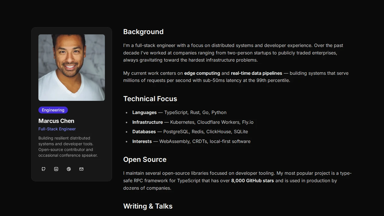
- Profile 2 - Sidebar Card: A two-column profile page with a compact card sidebar containing avatar, name, role, and social links alongside a prose content area.
- Profile 3 - Hero Banner Overlap: A bold profile page with a full-width cover banner, overlapping circular avatar, and centered name, role, and social links above a prose content area.
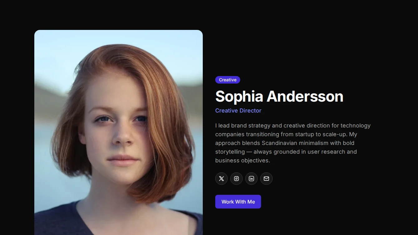
- Profile 4 - Split Magazine: An editorial split-layout profile page with a large image on one side, name, role, and social links on the other, followed by full-width prose content.
- Profile 5 - Card Profile: A refined card-based profile page with a large header image featuring a gradient overlay, name, role, social links, and prose content within a card body.
- Profile 6 - Sticky Sidebar: A documentation-style profile page with a sticky sidebar containing avatar, name, role, and social links, alongside a scrollable prose content area.
Services
1 new services block.
- Services 11 - Scroll Card Fan: A scroll-driven services section where square service cards enter from center and fan into a horizontal stack.
Testimonial
1 new testimonial block.
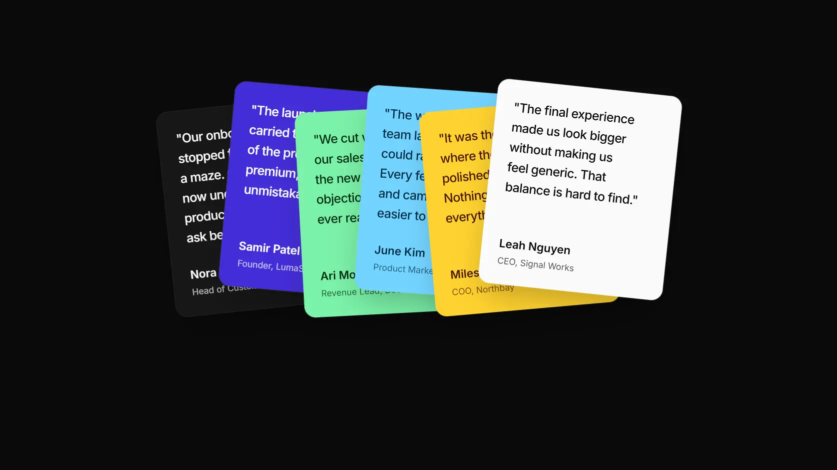
- Testimonial 9 - Scroll Card Fan: A scroll-driven testimonial section where quote cards enter from center and settle into a compact overlapping fan.
Browse all blocks at /components or install with the Starwind CLI.