Introducing Starwind Pro: Premium Blocks for Astro Developers
Stop building landing pages from scratch. Starwind Pro provides 140+ production-ready blocks designed specifically for Astro and Tailwind CSS v4.


Building landing pages from scratch takes forever. The hero section, the feature grid, the pricing table. It’s the same patterns over and over, so why keep rebuilding them?
Starwind Pro gives you 140+ pre-built blocks for Astro. Install what you need, customize it, ship. Crafted by the creator of the open source library Starwind UI.


What You Get
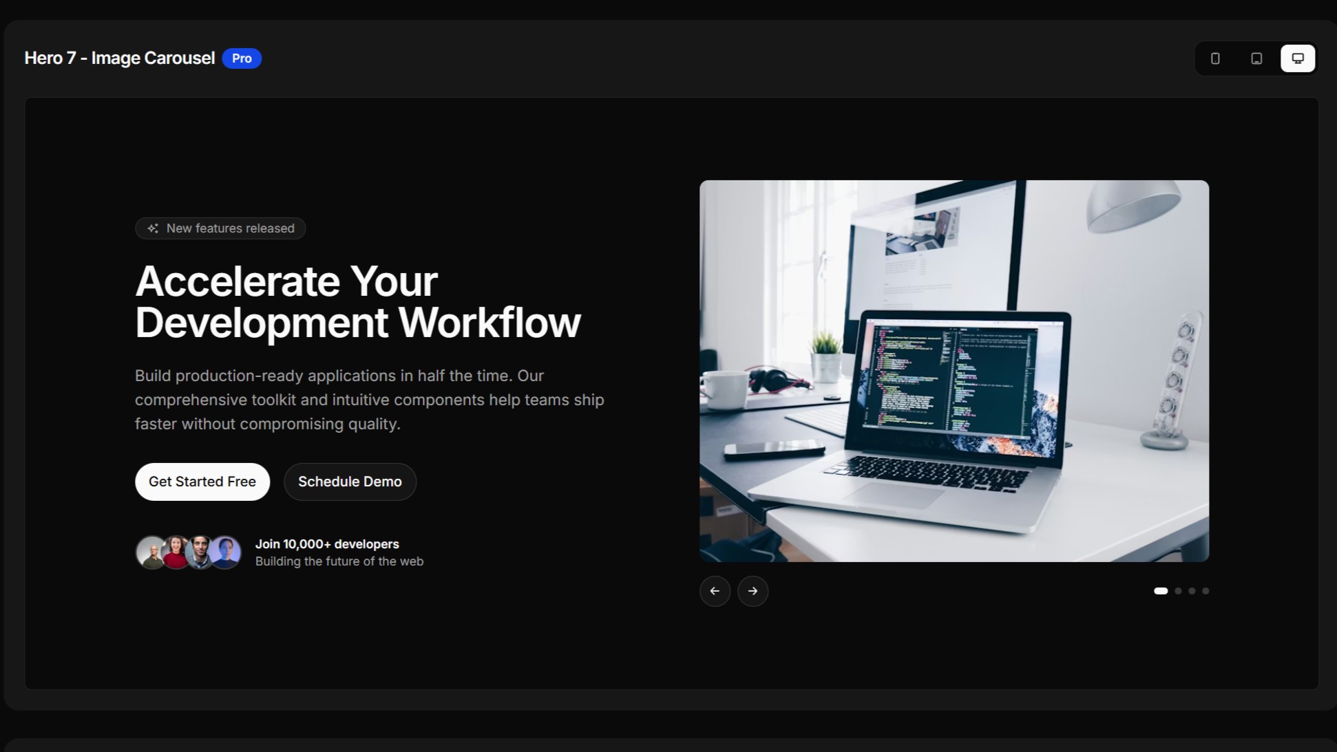
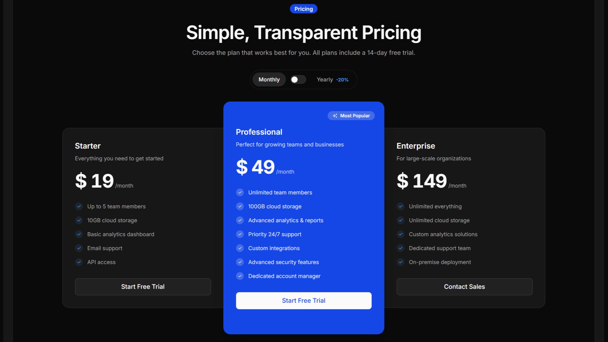
Starwind Pro is a collection of production-ready sections: heroes, pricing tables, testimonials, CTAs, FAQs, footers, and more. Each block is a complete .astro component you can drop into your project, with full props for easy customization.
These aren’t React components awkwardly ported to Astro. They’re built natively for the framework. View Transitions and other Astro features all work as expected.
INFO
Starwind Pro builds on Starwind UI, so if you’ve used it or shadcn/ui, you’re already familiar with the patterns.
Who Uses This
- Solo developers building SaaS products who want to focus on features, not layout
- Agencies delivering client work on deadline
- Teams who want consistent, reusable building blocks across projects
Why It’s Different
One Command Install
npx starwind@latest add @starwind-pro/component-nameThe CLI handles dependencies and file placement.
Built for Astro
- Native
.astrocomponent structure - View Transitions support via
astro:after-swap - Container queries (
@container) for component-level responsiveness - TypeScript interfaces for all props
- Tailwind CSS v4
Responsive by Default
Blocks use container queries instead of media queries. They adapt to their container width, not the viewport. This means they work correctly whether you’re using them full-width or in a sidebar.
You Own the Code
When you install a component, you get the source files in your project. It’s not a dependency. It’s your code. Change anything: styling, structure, behavior.
What’s Included
Blocks for every section of your landing pages and marketing sites, plus many more on the way:
Layout sections: Heroes, feature grids, pricing tables, testimonials, CTAs, FAQs, team pages, footers
Interactive elements: Navbars with mobile menus, carousels, accordions, theme switchers
Forms: Login, signup, password reset, newsletter signup
Effects: Scroll animations, marquees, 3D tilt
The library is actively maintained with new blocks being added regularly.
How It Works
- Set up: Run
npx starwind@latest init --proand add your license key - Browse: Find components at /components
- Install: Copy the command and run it
- Customize: Edit colors, content, layout
Full setup instructions: Starwind Pro Setup Guide
Pricing
One-time purchase. No subscription. Use it on as many projects as you want with free updates for life.
There’s also a set of free blocks you can try without a license.
Get Started
Questions? Join the community Discord or email support@starwind.dev